Monday, 14 December 2009
Commentary feedback
the fact that you have a group member missing will effect their individual ideas on the video, but the points were shared pretty equally between the two. There was a point where you had too many layers of audio, and other times when the points weren't conveyed to understanding. Apart from this you answer each question to a good extent and didn't dwell on points too long. Including a clip from Lilly Allen's video was a good exmaple of showing you intertextuality.
Group 43
Video quality poor - not your fault.
there is a part of the footage at the end which is un-rendered
at the start of the video there
there is a part of the footage at the end which is un-rendered
at the start of the video there
feedback from 44
It was good but onething that got our minds was when you said on the digipack that you used a black/white effect on the dvd cover, you actually inverted the picture from cambridge rather then grey scaled it which Pia says.
Your little Lily Allen part was very good as it allowed us to see what you meant.
Nice Work.
Your little Lily Allen part was very good as it allowed us to see what you meant.
Nice Work.
Feedback on Commentary from Group 45
We liked the way that your shots faded into each other instead of jumping from one to another, this made it look like one shot instead of many individual shots which was effective. We also thought that using a clip of the Lily Allen video was a nice touch, this was effective because it enabled us to visualise what you were talking about. Using the question over a snippet of your music video was a good idea because we knew what you were going to be talking about and what to expect.
Well done :)
Well done :)
Labels:
Bryony and Rose (Group 45),
Jodie
Thursday, 10 December 2009
Evaluation.
Evaluation
In what ways does your media product use, develop or challenge forms and conventions of real media products?
My music video challenges conventions of real media products as it follows the important Goodwin’s Points, for analysis my video includes genre characteristics. This is by using the stereotype of the genre “Indie” and following their rule of mainly performance and narrative. My video includes a story of the person’s life and how they go about their day, through their eyes. Unfortunately this then does not feature any lip-syncing and lyrics to music, but we do cover music to video as the video is very like the pace and type of music. I also don’t include voyeurism in the video as I didn’t want the audience to know what they looked like, so they can relate their lives more to the person, although it doesn’t have voyeurism it gives an insight into the artist’s life and that would appeal to fans. The video also contains Mise-En-Scene, for example, location, which is held mainly in Cambridge and a hometown this is realistic and believable, there isn’t anything fake, as we wanted to create a really believable world. Our video meets the demands of the record label by having the song playing, but that is about it as we don’t feature the artist and have resemble to the artist, it’s just a day in the life. I feel that our video is very like ‘All Falls Down – Kanye West and ‘LDN’ – Lily Allen, they both have the camera following them or looking through their eyes. This are the most interesting ones that are like ours, we tried to have them look a lot similar just change the Mise-En-Scene and song and stuff.
I also designed the whole of the Digi-Pack, this includes the picture of Cambridge, where we filmed our video, and therefore this is a good example of continuity as I have kept the picture of something people can recognise easily, to the video, also I kept both the DVD Advert and DVD Cover/Back the same image as people would be able to know what it is without even reading it and to make the band noticeable. The image was inverted to negative to give it an even more “Indie” and catchy look to it. The Digi-Pack also was very clear and helped with the marketing and publishing of the band; I feel it gave off the right look and image. My Music Video also has a voice over commentary to it, which was done professionally and featured everything that would be needed. I feel this challenges a real media product, as it is exactly what it is like in a real one. The artist is shown from the images to be a “normal”, mundane person just walking around her/his local town and waking up like anyone else would, for example, the audience gets to see what they eat fro breakfast and putting on their shoes.
How effective is the combination of your main product and ancillary texts?
I feel that the main project and ancillary texts are really effective, as we have in both things kept the Genre, INDIE, in the foreground. In the Digi-Pack I used the same type of writing as the band and other Indie bands have used, also the same picture, witch is like the video and other Indie bands as they all use the same picture or text on each different item. The DVD back and front are both of Cambridge streets, where we filmed on, and they have both been distorted slightly as to make them stand out and also to show that life isn’t straightforward. They both have the same font on each and have the same negative filter over the top to give even more of a weird and unusual feel, but at the same time recognisable look. The Digi-Pack and video link also very well as they both feature the streets of Cambridge and they both are Indie ‘like’. The magazine and advert both have the email, what’s on the DVD, record company and age consent. The advert promotes the DVD very well as it looks bold, so catches the audience’s eye. It also has where you can buy it and age consent so they know how accessible it is and for what people. It’s also very clear and understandable. The Advert does not have the artist on, but it attracts the audience by being bold and still in the Indie catchment, and it’s also the right image for the right age range and the right genre and like the video, so they will be interested in what the video looks like.
What have you learnt from your audience feedback?
I feel the feedback we were given was very helpful, but on the other hand not so. There was some really positive feedback, for example, they said how the rough cut of our video was a little confusing, in terms of the type of filter we used, so we decided to get rid of the filter and have it normal and mundane, like a real person’s life, to keep the continuity flowing well. On the other hand there was some negative feedback like they didn’t like the video and it needs a lot of improving, but this still helped us we looked over it and made it a little more interesting with extra footage and sharper editing. They helped a lot with the Digi-Pack as it gave me personally a lot more confidence and I felt that I did a really good job. The feedback said that the Digi-Pack is clear, understandable, catchy and includes all that is needed, apart from a few spelling eras it is really good. There was also a lot of feedback on the original idea that we had and that was also very positive and they felt that they understood the idea and were very intrigued to see how it turned out. So therefore we did not think about changing anything as we thought it was going to be great and so did the feedback. In the end we changed the idea and the audience didn’t like it as much but we had some good feedback like it needs more footage and the filters over the top make me feel ill! So we changed that and made it simple and we also filmed more footage. The feedback was from other groups in the class but they were also our target audience, if we had to pick one.
How did you use new media technologies in the construction and research, planning and evaluation stages?
In my music video I used Final Cut to edit the video, this helped me as it is really good at editing and makes it really easy to do so, also I felt very comfortable with it and using it. In the process I have learnt new techniques like fastening up the editing process by using shortcuts, also how to change the speed of the footage to create a different feel, how to use different filters and what they change, mould and create. This was really fun and I enjoyed doing it.
I also used the Internet to research other videos (www.youtube.com), Digi-Pack material (www.google.com/images), the blog to help plan ideas and create and do plans (www.bogger.com) (www.longroadmusicvideo.blogspot.com). These helped as I could create new, better, more challenging, exciting, talk about and compare ideas.
I used Photoshop to create the Digi-Pack, this was really fun and interesting, as I was learning while I was creating. I have a basic knowledge in Photoshop so I felt quite confident in the subject. I learnt new things in Photoshop, for example, how to invert and image and how to stretch and distort an image. I have advanced from As to A2 because I know a lot more editing techniques and filming techniques. The pre-him task helped me as I learnt loads of techniques and stuff that would help me to improve. I learnt how to edit in lots of different ways. Also how to link the footage to the song.
Labels:
Holly
Tuesday, 8 December 2009
Evaluation.
In what ways does your media product use, develop or challenge forms and conventions of real media products?
Our music video challenges may conventions of real music videos, This is what makes it fit its genre style of Indie/Alternative as Alternative videos can be abstract or differents and challenge the generic music video, Whilst Indie videos many consist of a documentry type video following the bands everyday life, or life on the road on tour.
The video we produced doesn't contain the artist so does not have lip syncing, neither does it meet the demands of the record label. It does show some Voyeurism as you are let into this persons head and life seeing everything through their eyes the way they would.
How effective is the combination of your main product and ancilliary texts?
Our music video & digipack do not link directly to one and other but there is some continuity, and certainly in our digipack. Both the DVD cover and advert use the same image of a street, Just not the same ones in our digipack as our video although they were both from cambridge. We had decided from the start that we would we would use the same image to create continuity throughout our digipack, we also used the same font style in both, This was so our tagert audience would recognise this when they saw it and this would make it easier for them to find in a shop or online.
From our feedback we have been notified of some problems with spelling in our digipack with the words 'Avaliable' and 'Wembley' and given the chance we would change these, apart from that our digipack includes the correct information for what they are.
What have you learnt from your audience feedback?
The feedback we have recieved from other groups has been helpful to us when planning and creating our video and digipack, from this we have known what was missing from our blog and thoughts on what we had produced so far. Whilst making our video we posted a roughcut onto our blog and from the feedback we recieved we found out that the effects we had used on it seemed confusing and made some people feel dizzy and so we removed these.
The feedback we recieved once the video was completed was around what we had been expecting and thinking ourselves or already knew about as we already knew that lots of goodwins points were missing, with basics like lip syncing and a main character or artist missing made our video abstract whilst still fitting its genre. They all also gave mixed feedback some said that the storyline idea was clear showing their daily life, possibly in the artists eyes, whereas others said there was no particular storyline
How did you use new media technologies in the construction and research, planning and evaluation stages?
Whilst researching and planning for our music video we used our blog and used google images and youtube alot to back up our ideas we had put on the blog with similar images to what we had in our heads and links to videos we liked and wanted to incorperate in our videos, for example when we first started on our ideas for 'The Hush Sound - A Dark Congregation' we had the same idea in our head when we listened to it of Lily allens video LDN where everythings half happy and colourful and half dull and mundayne, we linked our blog to the video and to some print screens to go on the blog. We used google to get existing images of things for our mise-en-scene like objects and settings, and later on used it to get existing posters and DVD/CD covers of from artists when planning and designing our digipack.
We made our music video using some software called 'Final Cut' which allowed us to capture our footage off of the video cameras and onto the computer and from this we were able to put our music on it alongside the video and cut up the footage acording to the track and to the points we wanted to. It also allowed us to put effects on we later took of and make transitions from one clip to another.
When making moodboards, cropping down or re-scaling images and creating our digipack we used Adobe Photoshop, which let us again use many effects and do lots of different things with our images, we could also move each layer seperatly without anchoring them down although we could do this at the end by flattening the image.
The main blog also helped us with knowing deadlines and what are blog and products should include.
Labels:
Pia
Monday, 7 December 2009
Evaluation
Here is my evalution for the Music video task.
In what ways does your media product use, develop or challenge forms and conventions of real media products?
For our media product which was a music video, we tried to use the conventions from a real music video of the Indie Genre but at the same time challenge the forms and conventions. we decided to keep it random, like other Indie music videos but also challenge other video's in general by not having the popular choice of a story/narrative. Our group identified what the lyrics were and we filmed a documentary type film of everyday life, for example eating breakfast, so the audience can make up there own mind of what the lyrics mean to them so a narrative type film did not distort what the song meant, if we had filmed a funeral scene, the audience may have associated the song with a loved one who had passed. But by filming a random blank documentary type video, they can associate the lyrics “Save me, I am swallowed by the guilt of this You're gone, sleeping in the dust We will not let time erase us” to anything that the audience wanted to relate them too as it could mean a lot of different things depending on a situation someone is in. We chose to film with a hand held camera to give it a more realistic point of view as it would be shown from looking out of the main persons eye in the video, basically what they were seeing. In the mise-en-scene we didn't use one of Goodwins points - music and visuals, such as lip syncing, which we couldn't as we were filming from someone's point of view, it would be quite difficult to do. We also did not have a relationship between music and visuals as such, for example we didn't have people breathing cold air as the lyrics “our breath rose in the cold” This was because we wanted the audience to make up there own mind about what the lyrics meant. Another one of Goodwins point's 'Promoting the artist' was another hard thing to include in our music video as our group wanted to promote the music as a whole rather than one artist or a group, in a way we did promote the style of the music by being documented and this is identified on our Digi pack. There is a lot of voyeurism in our music video, as we are filming from the main characters point of view, we are able to look out of their eye and the whole audience is in disguise because of this, we are watching the character eating breakfast and when they enter a busy city centre we are able to watch everyone else go about their normal day behind these eyes, and in disguise as the main character in the music video. This is different to other types of voyeurism for example in R&B music videos they use voyeurism a lot in a sexual way towards men and women, the audience gets pleasure out of looking at these people in the music video without being there themselves, they are behind closed doors and in the privacy of there own home if you like. Lily Allens video 'LDN', there are two videos for this, one where she is biking through the streets of London, and another where she is walking though the streets but everything negative gets changed into something positive. For our original idea we were going to try and follow this idea, but unfortunately I wasn't there for this part of the filming therefore Holly and Pia had to think on there feet and decided to film through town, which kind of fit the other type of “LDN” video. I re-searched a video i new that fit our type of filming which was “All falls down” by Kanye West, this is also filmed from his point of view and through his eyes. Our video is like this for example, locking up bike and eating breakfast etc. Although in Kanye west's video they still are promoting the Artist (Kanye West) by editing the video and making it look like when Kanye looked in the mirror it showed his reflection, this was too difficult for us to do whilst making it look professional so we left it out, otherwise we would have been able to include lyrics and visuals. The video is effective because it is not distracting the audience from the lyrics and music. I suppose our video attracts our target it audience by the video being 'random' if we included a lot of 'bling' jewellery i don't think the target it audience would of continued to listen or watch the video. Our location was not very conventional which is a good thing i think, it's different and we used the City centre of Cambridge which i think has a good variety of buildings all in one location, you have the old college type buildings for example 'Lloyds TSB' bank, which is included in our video, and opposite this building we have a new modern type building where 'Boots' is located. This gives us a good variety of architecture without having to change location. A more Conventional location for this particular genre would be maybe inside a club whilst the artists are performing.
How effective is the combination of your main product and ancillary texts?
The ancillary texts meaning digipack and the music video are quite effective. The DVD cover and magazine advert are the same style and picture so the buyer will be able to identify the two together which makes it easy to identify the music and band due to the continuity of the images used. Seeing as we didn't have a main character in the video, we chose not to put one on the DVD cover and the magazine advert so the audience wouldn't be confused because in our video the artist is not sold or promoted, therefore the audience would not be able to identify who the person or people were on the front if we chose to show one or 3 people on them. We did however choose to have a picture of a normal street on the front of the DVD cover and Magazine advert to elaborate on the documentary type video. This would be effective as it's the same type image being shown as there is in the video, this is something the audience can identify together. Our magazine advert contains a 'NME' which stands for national music express which is a popular music magazine, people that buy this magazine and enjoy this type of genre can relate to this music group and it may interest them even more. It also contains the music groups website so people would be able to re search the music group in their own time if they would like to know more about them. We have an 'Indie Uprising' logo which people who like the Indie genre of music can recognise and know it's an official Indie genre music group and that they have been recognised so that's a sort of guarantee that they must be good, otherwise 'Indie Uprising' would not be helping to promote them. We have a quote on the front of the magazine advert to show that other people are enjoying the music and are encouraging you to buy it. The advert also promotes the DVD, although it doesn't have a date it states that it is now available to download and on DVD. Also shown on the Magazine advert we had the 'HMV' logo which is a very popular music shop telling the audience where the DVD is available to buy. The DVD cover has all of these aspects, but also shows a 'dvd' sign stating it's a dvd and a bar code obviously, so it is able to be bought, this gives it a realistic effect. All three products represents the genre successfully, through the images the music used.
What have you learnt from your audience feedback?
For our original edited music video, we had an effect which distorted the faces of people in the video it was quite bright and quick, with our class feedback we learnt that this confused the audience and they didn't enjoy watching the video. Our group removed this effect to make it more pleasurable for the audience to watch. Our target audience for our music video was 15 plus, this was to make sure that they were capable of understanding the lyrics. It was good getting feedback from a range of students so that we got feedback from people that have different interests in music and genre not just an indie audience this would make it bias so we wouldn't get an open honest opinion. This video would more likely be played on a Indie music channel, for example MTV has now been divided up into different channels by what genre the music is, for example MTV base is for more R&B and hip hop music. We also learnt from our original pitch feedback that maybe we could of included more footage of a main artist or character, this was so we would be able to promote the artist more, it was difficult to do this seeing as we didn't have any close up and facial footage of anyone. But this also leads to a type of mysterious sense, and the audience could be left puzzled wanting to see more of the groups music videos to find out who she or he is.
How did you use new media technologies in the construction and research, planning and evaluation stages?
For our re search and planning we used the internet on the mac computers which was very helpful for us to research similar music videos to our idea we used websites such a 'You Tube' (www.youtube.com) And 'Google Images' (www.images.google.com) We also used a website called blogger (www.blogger.com) which allowed us to update any of our plans and ideas and it allowed our media group to view and give feedback on work we had been doing. For our actual filming we used a camera from college and we then uploaded our filming on a programme for final cut, this programme allowed us to add the audio from our song and put it together with the video, we were able to cut the video and stretch it to match what bit of audio we want it to match up with, we also were able to add text or different types of effects to our video. Since last year, there has been much improvements since the preliminary task music video, we have edited in debt, using the cut tool on final cut, cutting in particular places of the filming to match specific bit of music. Where we want the video to fit the beat we were able to cut using the 'razor blade' and give it a more choppy effect instead of fading each section we wanted in. I was able to transfer the music video into a Quicktime format and change the quality of the video making it into high or low quality. This was to upload it onto the blog (www.blogger.com) and youtube (www.youtube.com). Obviously we had more time in this task than the preliminary task from last year and we new we were going to be marked on it so we made a lot more effort on final cut. I also advanced my use of technology by learning to use the time remapping tool, speeding up our video at the chorus (in the rough cut) and slowing it down during the verses. Last year during the preliminary task last year we didn't really focus on these tools in the final video, we were mainly experimenting so we could use them in this years task. Photo shop was a very good programme to use for the Digipack (DVD cover and Magazine advert), we were able to print screen a picture from our video, and use this image for both the dvd cover and magazine advert, we were also able to save pictures we used as our logos for example the 'NME' and 'HMV' logo and drag them into place where we wanted them. We also were able to write our own text on the image, giving it the realistic effect, writing the name of the band and the title of there album, also writing the track list on the back view, and a bonus view for whoever is going to buy this and watch it, therefore they would feel they got something extra for their money, making it more appealing. We also were able to use effects such as the 'negative' effect for the DVD and magazine advert. These new technologies were helpful to maintain our genre with ordinary pictures that we used and filming that we filmed.
Labels:
kim.
Sunday, 6 December 2009
Video for evaluation.
Me and pia filmed the video for our evalution in room d109, we only had roughly about 30 minutes to film as i had a hospital apointment, so we were a bit rushed but we managed to film something for each question, we tried to keep our video casual but still professional but as i put earlier we only had 30 minutes to film. We aimed to give detailed answers and include what we have written in our written evaluation.
Labels:
Kim
Thursday, 3 December 2009
Commentary over video ideas...
We plan to have a casual, talking to camera type of commentary.
We are going to use clips of inspiration and clips from our video to help explain our point.
We also intend not to cover it all in great detail and just to briefly mention the important points.
It would be nice to do it in the street as it would relate very well to the video.
We're not going to script it a great lot and just let it come out fresh. (chatty)
Labels:
Holly
Monday, 30 November 2009
Peer Feedback On Digipack
DVD Cover:
Magazine Cover:
The advert does contain the information which i would expect to find on a poster style advert. For example
Feedback from 44
Your DVD Cover and Magazine Cover both shows the necessary information required for both. Nice work on this area.
You don't really have an artist promoted here so to put that aside you've shown images from your music video inverted which works well as a teaser for what to expect from your video.
There is continuity from your DVD and Magazine covers through the use of the same picture from the front cover on the magazine as the same on the DVD Cover.
Unfortunately your grammar mistakes might effect your grade. You've spelt Wembley and available incorrectly.
Nice Digi-pack!
Digipack Feedback from Group 45
Your magazine advert and DVD cover are both very creative and certainly different. I like the effect as it suits the the name of the band and looks effective however, although they have continuity with eachother, they do not have continuity with the video. All of the information on the DVD cover looks professional and is set out well. The magazine cover also looks professional and is composed well.
Group 48 digi-pack feedback
Your magazine advert is good and shows continuity in the location that it was shot. The only thing id say to criticize is maybe the effect is a little different from your video, but its not really a big thing as it works well with the poster and the title. The DVD cover is also good, it includes all the information that it needs to have with good creativity.
Labels:
Group 48
Monday, 23 November 2009
Digipack (DVD/CD)
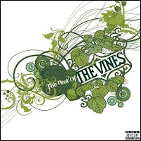
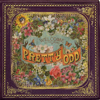

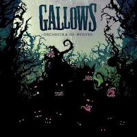
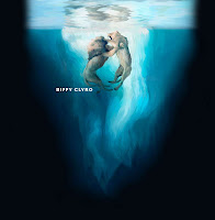
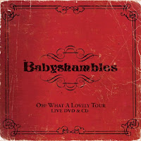
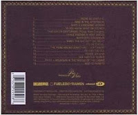
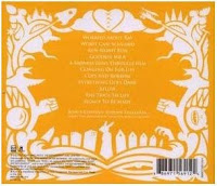
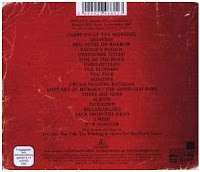
Theses are the relating to the Tour/Album adverts, as you can see the images are roughly the same as the ones in the adverts and so they have continuity throughout and make it easier for the buyer to recognize the album instore. The covers don't contain much, just an image, Band name & album name and on the back they would have the track list.

Digipack (Adverts).
Existing Adverts.
Here is some existing Tour/CD Posters.
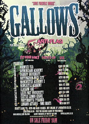
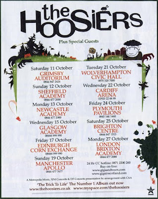
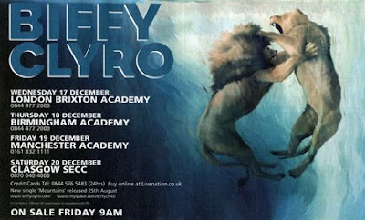
In all three of these tour posters the basic layout is fairly similar, with the Band name/logo at the top in the biggest and boldest font, with the tour dates then underneath with the venues in larger/bolder font than the dates. At the bottom there is then some information on contacts for booking the tickets, when/if their album is out, the bands website(s) and any other sites. All three also have images related to their tour/Album to promote them.
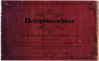
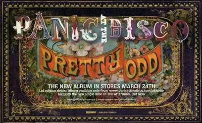
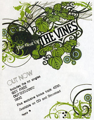
These three adverts just promote the CD/DVD Album. They all have the same images from their album artwork, with brief information on when/where to get it from, whats the product includes and any additional websites.
Here is some existing Tour/CD Posters.


In all three of these tour posters the basic layout is fairly similar, with the Band name/logo at the top in the biggest and boldest font, with the tour dates then underneath with the venues in larger/bolder font than the dates. At the bottom there is then some information on contacts for booking the tickets, when/if their album is out, the bands website(s) and any other sites. All three also have images related to their tour/Album to promote them.


These three adverts just promote the CD/DVD Album. They all have the same images from their album artwork, with brief information on when/where to get it from, whats the product includes and any additional websites.
Labels:
Pia
Thursday, 19 November 2009
Digipack Anaylis...
This is the DVD Digipack.
This DVD cover and back has all the expected things that you would have on a DVD.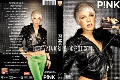
This is the Advert for the DVD.
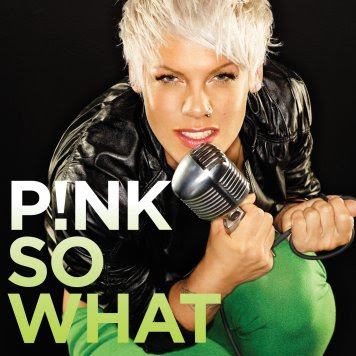
This DVD cover and back has all the expected things that you would have on a DVD.
- Information - websites, age range, warnings, name, whats on the dvd, etc...
- Demands of the record label, as the artist is fully faced on both sides.
- It's also very basic on the front so, easy to understand.
- Has the DVD symbol so you don't get confused.
- Details about the artist.
- Bar Code.
- Any other products that relate to the artist, if necessary.
- Also special features.

This is the Advert for the DVD.
- The advert here is ahieving bold, impact full and intreging messages.
- It shows the artist off and the name of the DVD and the name of the artist.
- It makes you want to know more and use your initiative to find out what it is by using resources.
- In most DVD adverts you would expect to see...
- Information about the artist
- Information about what the artist also sells.
- Information about the details of what the DVD is about.
- Websites.
- Feedback and reviews about the DVD.
- Where it's available from.
- When it's out.

Labels:
Holly
Digi Pack
A magazine advert for a DVD would include a record label, DVD title & artist, Star rating and review quotes, the band's web site(s) and information on when and where to buy them.
It needs to be able to attract the audience eye, and also appeal to the right audience, maybe have something that can be specifically identified to that band for example a logo or an image of them. Its can also show the same or similar image as the album cover so the buyer can identify it easily in a record shop.
The advert must be eye catching and must attract the right kind of audience for that genre of music. It should contain basic information which lets the buyer know important information about their product and this could include the rrp.price.
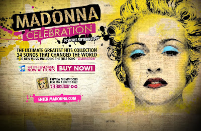
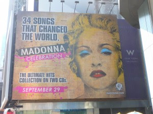
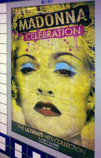
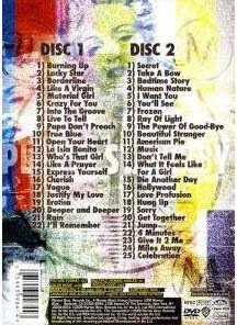
A DVD cover would usually include the artist name & album/DVD title on the front cover with track names & numbers on the back, similar to an ordinary album cover. It may also include, Record labels, a certificate rating for age, special features and additional features. Here on Madonna's video collection DVD it has her (the artist) on the front, with her name. It also has the DVD symbol to show it's a DVD. It also has her record label in the bottom left hand corner, back and the spine of the DVD case. On the back it has the bar code for obvious reasons and the track list of what videos can be played these are dated from when they were released as the DVD album includes her videos from 2000-2006. There is also a seperate section for special features which are unreleased videos. The front and back of the cover both include a picture of madonna. There is also the DVD logo on the front, spine and back of the cover.
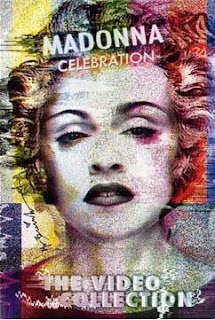
It needs to be able to attract the audience eye, and also appeal to the right audience, maybe have something that can be specifically identified to that band for example a logo or an image of them. Its can also show the same or similar image as the album cover so the buyer can identify it easily in a record shop.
The advert must be eye catching and must attract the right kind of audience for that genre of music. It should contain basic information which lets the buyer know important information about their product and this could include the rrp.price.


A DVD cover would usually include the artist name & album/DVD title on the front cover with track names & numbers on the back, similar to an ordinary album cover. It may also include, Record labels, a certificate rating for age, special features and additional features.
 Here on Madonna's video collection DVD it has her (the artist) on the front, with her name. It also has the DVD symbol to show it's a DVD. It also has her record label in the bottom left hand corner, back and the spine of the DVD case. On the back it has the bar code for obvious reasons and the track list of what videos can be played these are dated from when they were released as the DVD album includes her videos from 2000-2006. There is also a seperate section for special features which are unreleased videos. The front and back of the cover both include a picture of madonna. There is also the DVD logo on the front, spine and back of the cover.

Wednesday, 18 November 2009
Group 48 feedback on Final Video
The genre characteristics of this music video are very conventional because its very abstract and unusual.
This video is different to many girl bands videos but as its original it is good in its own way.
There wasnt really any relationship between the music and visuals but as its an abstract video we were not expecting any. This was the same for the relationship between lyrics and visuals.
It featured the same shot of looking through the persons eye shot which was effective. This helps with the idea of voyeurism because it implies that your watching through their eyes.
Feedback from t2 - 44
This... POP genre was cool.
We think the characteristics of the genre seemed a bit different to what most are used to. This was an experimental music video and showed us in the eyes of the main character. Has it sold the artist? Not really, it has given a portrayal of the life of the artist (maybe) but it hasn't given any selling of the artist itself.
I don't think there was any voyeurism at all.
But. There was a relationship between the music and the visual as it did have changes reference to the music which worked well. It gave a storyline idea with a timeline showing the day and a life of someone which turned out well with point of view shots.
Labels:
44
Monday, 16 November 2009
Final Idea!
In the end we decided to keep the original idea as it made more sense, in such short time.
Monday, 9 November 2009
DIGIPACK Final Design!
This is our Tour Poster...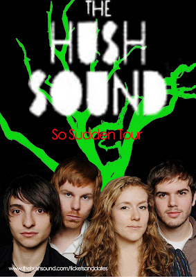
This is our DVD Poster Final...

This is the CD cover and back...
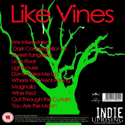


This is our DVD Poster Final...

This is the CD cover and back...

Back...

Front...
Labels:
Holly
Thursday, 5 November 2009
Plan C, Filming plan
We plan to film out of college on Tuesday 10th November, where we plan to get our Graveyard/Flashback scenes done. We can then Film the Artist lip sync parts on our morning lesson on Wednesday 11th November as this part can be done at college in the media studio or behind the stage in the hall.
Hopefully if everything goes to plan we'll be on schedule for the Music Video Final Deadline: Last lesson of week ending 13th November
Hopefully if everything goes to plan we'll be on schedule for the Music Video Final Deadline: Last lesson of week ending 13th November
Plan C, Goodwins Points
- Genre Conventions - We are following the genre because in most 'indie' music videos there is a story or maybe certain emotions or memories being shown in the footage. In our case we are going to have footage of a person mourning over a lover and their story in flashbacks.
- Lyrics & Visuals - The lyrics are going to relate hugely to what we will be filming as we almost follow the lyrics as they go, for example, "A red rose fell upon the soft snow...", we are going to have a red rose falling on to a grave. And so on.
- Music & Visuals - We are going to have maybe editing to the chorus and the verses which will be cut to certain footage.
- Demands of the record label - We can't really promote the real band as we do not have them & we can't link our video to any of the hush sound's as they don't have any.
- Voyeurism - We are going to show the main artist in close ups, and clips, so the audience gets a good idea of what she looks like and how she is dressed etc...
- Intertextuality - There wouldn't be much of this as we are showing the artist off and it's a story, so there would not be any reason or right time to put the album or poster in the film.
Labels:
Holly...
Plan C, Mise-en-scene
- Location(s), Graveyard, Media Studio in either the white/black room. The graveyard location we plan to use will either be a graveyard near Kim, down ditton lane or one in reach.


- Clothing, Main Character (Graveyard): Dark/Dull clothing, Wintery Clothes to go with their emotions... Not colorful & Bright. Main Character & Lover (Flashbacks): Any normal/Everyday clothing.. can be colorful to reflect the happy emotions. Artist: Isn't particularly important as if we do close ups then they would only see their face/top of clothing so make-up/hair would be more important for this.


- Props, Red rose.

Labels:
Pia
Plan C, moodboard
Graveyard scenes moodboard.
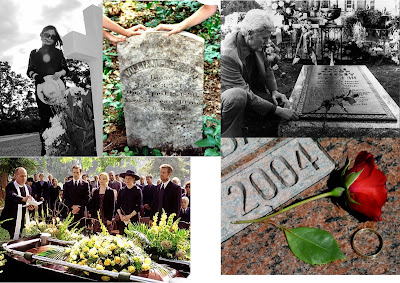
For our grave scene we are planning to have the main character at the grave of their lover, where they are greaving and remembering the good memories that they had with that person. I also thought that the red rose on the grave could also fit in with our lyrics 'A red rose fell upon the soft snow'. I also think that for our editing on this piece that it should be made black and white or we should desaturate the colours to make it seem cold and sad.
For our grave scene we are planning to have the main character at the grave of their lover, where they are greaving and remembering the good memories that they had with that person. I also thought that the red rose on the grave could also fit in with our lyrics 'A red rose fell upon the soft snow'. I also think that for our editing on this piece that it should be made black and white or we should desaturate the colours to make it seem cold and sad.
Memories/Flashback Scenes Moodboard.
At the moment for these scenes we are not exactly sure what the flashbacks will be of but this just gives a brief idea of what memories that they could have shared.. it also gives an idea of what effects we could put on these clips, a kind of low fi old fashioned coloured picture.
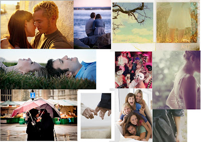
Artist, Performance Moodboard.
This is just a basic idea of what we could do for our performance. As we dont have much time the idea for this is just to find a girl to Lip Sync for us and so that we have more time for our other scenes this will probably be done during one of our lessons in a studio so that the person feels more comfortable and we can control the lighting/background more. She will probably be infront of a plain white/black backround and the shot will probably be a close so we wouldnt need to worry about if what she's wearing fits in with our genre as it would only be some of her top in the frame.
This is just a basic idea of what we could do for our performance. As we dont have much time the idea for this is just to find a girl to Lip Sync for us and so that we have more time for our other scenes this will probably be done during one of our lessons in a studio so that the person feels more comfortable and we can control the lighting/background more. She will probably be infront of a plain white/black backround and the shot will probably be a close so we wouldnt need to worry about if what she's wearing fits in with our genre as it would only be some of her top in the frame.

Labels:
Pia
Examples of similar videos.
Here are some video with similar ideas to what we want ours to turn out like, and with the use of funerals/graveyards/flashback, etc.
This video shows Amy miming throughout & the plot is of her walking with a precession of other people many of them carrying instruments with a hearse. When they arrive at the graveyard the grave is small and they put a small box in it & say their goodbyes, at the end R.I.P The heart of Amy Winehouse comes up.
The whole video is in black & white making it seem cold and also re-inforcing the song title 'back to black' with the colour video going back to black and white.
- Amy Winehouse - Back to black http://www.youtube.com/watch?v=aygAu1x2uQo
This video shows Amy miming throughout & the plot is of her walking with a precession of other people many of them carrying instruments with a hearse. When they arrive at the graveyard the grave is small and they put a small box in it & say their goodbyes, at the end R.I.P The heart of Amy Winehouse comes up.
The whole video is in black & white making it seem cold and also re-inforcing the song title 'back to black' with the colour video going back to black and white.
- My Chemical Romance - Helena
This video show the band at a funeral of 'Helena' with the frontman of the band giving the service and when they all close their eyes to pray, 'Helena' gets out of the coffin and starts dancing then closes her eyes and falls back into the coffin. Many other people at the funeral also start dancing and the bands performance is also in the church. The band then carry out the coffin to the hearse whilst other people dance with umbrellas. - Avenged Sevenfold - Seize the day http://www.youtube.com/watch?v=XZOY6eP-q4o
This video begins with the band performing behind bars and then cuts away to the frontman with his girlfriend and a camcorder recording each other, all loved up. The other band members then come round and tell him something he then tells his girlfriend who trys to stop him. The next part is of them robbing a store but the police come and catch the frontman who is then put in prison. The Girl then is in her car which is hit by a truck. There is then the group of people at the funeral as the coffin is lowered into the grave, whilst the guitarist plays a rift ontop of the coffin. We then see the frontman in prison having flashbacks to him and his Girlfriend and footage from the camera, he is then let out and they all vistit the grave- Funeral For A Friend - Roses for the dead http://www.youtube.com/watch?v=zVG17cTHkEE
This video is another example of flashbacks with the boy on his journey to the rooftop and what he had done before he got there and cut-aways to his mother in his room after he has jumped. There are then flashbacks of when he was younger as he gets to certain places or his mum finds certain objects, ie. there is a flashback to him getting a guitar for his birthday/xmas, it then cuts to his mum holding the guitar. & another example is when he gets to a park and it cuts between him in the park to him as a child on the swing to his mum holding the hat he was wearing when he was younger and then back to him on the swing.
Plan C...
After looking closer at the lyrics we've realized that the song is about the funeral of someone's (the main character) lover, The very first opening lyrics give this sense.
'A dark congregation of familiar faces gathered around the quite earth
A red rose fell upon the soft snow, prayers were whispered so slow from our mouths'
The idea for our music video that we have produced from this idea is that we would have about 3 actors, people in our music video.. The Girl/Guy who was mourning, Their lover in flash backs and someone to play the artist miming for cut-aways.
So our video would be made up of 3 main parts. Our main character at the grave mourning, Then the main character in flashbacks of memories with/of their lover and cut-aways to the artist miming along to the song in a performance type situation, which we could possibly just film at school. This would mean that we could probably get all our filming done in one night and use our over night of taking the camera out to get the footage of the grave scene & Flashbacks.
Our main problem is that the editing deadline is at the end of next week so we dont have long to get all our footage taken & edited, as we have this problem we've decided that we will also carry on with our current idea & footage as a back up for if we don't manage to get this idea completed in time for the deadline. Another problem is that the lyrics our down and depressing and give this feeling whereas the music with the piano sounds quite upbeat.
Wednesday, 4 November 2009
Tour Poster
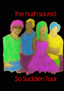
Here is an idea for our groups tour poster, Pia drew a cartoon picture of the group and we have used bold colours to colour in roughly the clothes, this is to try fit the genre of the music, a indie funky effect but also to draw attention to the publics eye so that they notice the poster and take interest in it. We are aiming to make our dvd cover very similar to the tour poster so fans or the public that have seen the two can identify a specific style or pattern of the group. It may be more noticable to the groups fans but it's going to still be made attractive and bold for the other majority.
Monday, 2 November 2009
feedback on feedback
most of the things that were said i agree with and will use the good points to make our video better, although the comments that were about the beggining , where we havn't got enough footage yet, its not going to stay like that we are going to fill it with footage, also we plan to shoot some lip syncing.
Labels:
Holly
Roughcut Feedback
After watching your roughcut we feel that the idea behind your video is good and the editing where you have turned the footage black and white is effective, however it became quite confusing and made the viewer feel a bit disorientated as the camerawork was a little too shaky. We also felt that the continuity of the footage was a bit random as it kept changing between colour and black and white. There was also no footage of the artist therefore lip syncing cannot be including.
The pace of the editing reflected the pace of the song well. The written description of the missing footage enabled us to create an image of how the video would look and we think that once it is filmed it would look good :)
The pace of the editing reflected the pace of the song well. The written description of the missing footage enabled us to create an image of how the video would look and we think that once it is filmed it would look good :)
Labels:
Bryony and Rose (Group 45)
Feedback from 44
We felt as a group that we liked the idea of the experimental video, however we feel that the effects was too much, as it confused the audience and hurt our eyes abit. Therefore we think that the audience would not watch it again.
The start with your black and white handheld camera worked came across a lot like a rock themed video and it didn't seem to work for us. But the colourful concepts are smart plus your mirrored symmetry technique did come across smart.
It's also well that you rather then fill in with black in where you haven't done a shot you've instead narrated what will go there.
Group 48 feedback on roughcut
This s a good rough cut. Obviously as you have said you need more footage, it could be good if you got some other shots in that space that are other than point of view, like some closeups or med shots of the girl in her house. Maybe some high angled ones to show how low she feels at the beginning. Also maybe if you could fit in the artist from somewhere? As we think you need to promote the artist a little more, and although the video idea is great you might not meet the marking criteria fully.
Hope that helped.
Hope that helped.
Group 43 Feedback
hi, although you have most of the footage there is some missing (although you are probably aware of that.) The text that you added helped us to visualise what it will look like when complete.
You need to find a way in which to include some lip-syncing in the footage.
The feel of the video is very abstract which does fit the pace of the song and parts of the editing do change on the beat.
This would make it sell easier to the artist as it suits the song and will appeal more.
More variety would help the video stay interesting and keep the audience watching.
Thursday, 22 October 2009
Digi Pack Idea...
This is our idea of the digi pack...
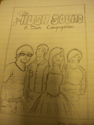
This our idea with a little colour, Just to give and idea.
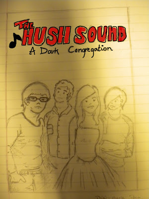
&& This is an idea for a possible Tour Poster..
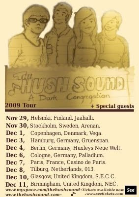
It incudes informations about where the tour is taking place, where tickets are available and promotes the band, their new single and bands websites. I think i may put abit more information into our tour poster like the release of the album with an image of it and an itunes image & website.
As you can see we have chosen to use continuity throughout our digipack in this case using the same image for both, for our final version we may use the same image, if now then i thiink that our images would be very similar. In the poster i use the colour picker tool and took a sample colour from the image, just under the end of sound and used it as the background colour and then decided to use a brown colour for the text as it would stand out, and used this for all the info on the poster.
I did the text using GIMP2 which is similar to photoshop and so i used a text from there switching through the different bold/italic versions of it, the text was DejaVu Serif Semi-Condensed.

This our idea with a little colour, Just to give and idea.

&& This is an idea for a possible Tour Poster..

It incudes informations about where the tour is taking place, where tickets are available and promotes the band, their new single and bands websites. I think i may put abit more information into our tour poster like the release of the album with an image of it and an itunes image & website.
As you can see we have chosen to use continuity throughout our digipack in this case using the same image for both, for our final version we may use the same image, if now then i thiink that our images would be very similar. In the poster i use the colour picker tool and took a sample colour from the image, just under the end of sound and used it as the background colour and then decided to use a brown colour for the text as it would stand out, and used this for all the info on the poster.
I did the text using GIMP2 which is similar to photoshop and so i used a text from there switching through the different bold/italic versions of it, the text was DejaVu Serif Semi-Condensed.
rough Cut
Evaluation of Rough Cut.
As You can see we haven't got alot of our footage yet, so instead we have just put text telling the view what should be in that place. Over half term we are planning to get a camera each and to all get some footage done which we can choose from to put into our video when we come back, our video will include some lip syncing which i hadn't put into the rough cut as we're not sure where it will come in the video. The footage should be of any everyday life and it is just an example in the video, it may change once we come back. But, with the footage we have we have been editing it and trying out lots of different techniques in it like threshold and a mirror effect.
Wednesday, 21 October 2009
Moodboard
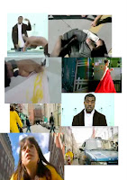 This is a quick moodboard from some of the things that inspired us for our video, these include Lily Allen 'LDN' and Kanye West All falls down
criteria...
We need...
Holding A Shot Steady
We have a shot of the person taking the camera around her life, standing looking at herself in the mirror for a couple of seconds.
Variety Of Shot Distances
We only have two long shots and they will feature different angles and shot distances.
Selecting Mise-En-Scene
We are going to show the character wearing quite Indie clothes, we already have the shot of the town which is quite an indie thing to do.
Using Varied Shot Transitions
We are going to use some transitions when we go from the two different shots.
This is what we are going to do over and after half-term.
Tuesday, 20 October 2009
Film Plan..!
I was thinking for the filming over half term because the filming was done in cambirdge city centre i could also take some footage of that as it is the same urban area, and i could do some filming where my home is placed as it's kind of fits the scene, so i am going to get hold of a video camera take some of my own footage so when we come together (Me, Pia and Holly) after half term we could take some film of both of the camera, and use what we think is appropriate, at least we would all be working together and not having to just depend on one person so it's a bit fair for us all!
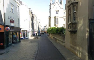 <--- Also i could film where we previously filmed, in the city centre seeing as i live roughly about 15 minutes away so it wouldnt be so much of a change of scene.
Labels:
Kim
Monday, 19 October 2009
Filming Plan.
We Plan do get filming more filming done by the time we come back from half term, this means that filming will take place over half term and i will need to find my own camera and get it checked by the college this week so that we can be sure that we'll be able to get some filming done.
The filming will be of any everyday life.. i.e. Waking up, Getting up and ready, making breakfast, riding a bike, going out.. etc. We do have some set ideas for what we want from this, we want the footage to be from our point of view and will introduce the lip syncing through a mirror or in a similar way. I will probably use my bike for the bike footage and put the camera in my basket... my only problem is that the footage we currently have is in an urban area and i live in a very rural area, also the footage of the bike in town is a different kind to mine so that may be strange.
Location(s)
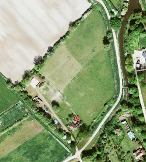
Reach.

Labels:
Pia
Wednesday, 14 October 2009
shots of ideas on filters....
These are some of the filters that we will be using...
Threshold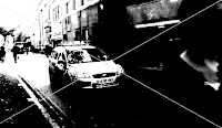
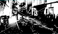
Fish Eye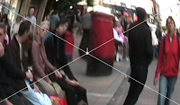
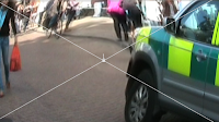 Mirror
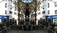
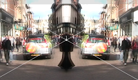
We also sped the video up to 250 to add an effect that would look like the day is so boring that you wish you could speed up time.
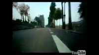
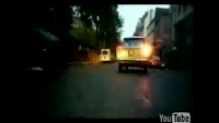
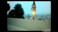
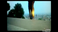
.. The footage we've got at the moment is similar to the video for Snow Patrol's 'Open your eyes', where it is footage from their camera being attached to the front of their car & the view from the car http://www.youtube.com/watch?v=H1XUbJEPShE
Threshold


Fish Eye

 Mirror

We also sped the video up to 250 to add an effect that would look like the day is so boring that you wish you could speed up time.
.. The footage we've got at the moment is similar to the video for Snow Patrol's 'Open your eyes', where it is footage from their camera being attached to the front of their car & the view from the car http://www.youtube.com/watch?v=H1XUbJEPShE


Labels:
Holly


